Headlines, thumbnails and pre-landers: creative strategy for content feeds
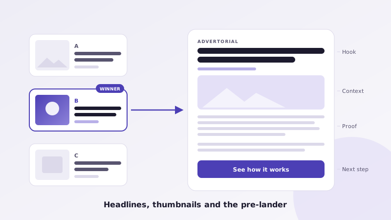
On Taboola and MGID, the creative is small and the stakes are large. A headline and a thumbnail decide whether anyone reaches your page, and the pre-lander decides whether the click was worth paying for. This article covers how we write for content feeds, how we build pre-landers that keep the headline's promise, how often we test and how we stay inside platform policy while doing it.
Creative in a feed competes with journalism
A search ad competes with other ads for a person who already wants something. A native ad sits in a recommendation widget beside editorial headlines written by professionals whose job is to earn the next click. Your headline is judged by the same reader, with the same thumb, in the same half second. If it reads like an ad, it loses. If it reads like a story worth a minute, it gets the click.
That does not mean imitating news or hiding that it is sponsored. Both networks label sponsored content and both reject creative that pretends to be editorial. It means writing with the specificity, curiosity and restraint of a good feature headline, about a subject the reader did not know they cared about until they saw it.
Headlines: angle first, then variations
We start with angles, not headlines. An angle is the reason a reader should care: a problem they recognize, a comparison they have wondered about, a mistake they might be making, a change in their situation. For a home services offer the angles might be cost, timing, a common misunderstanding and a local factor. For a product they might be an ingredient, a mechanism, a comparison with the usual choice and who it is not for.
For each angle we write a batch of headlines in different structures: a specific statement, a question, a how-this-works, a who-this-is-for and a plain description. Native headlines work best when they are concrete and slightly incomplete, so the page has something to finish. They fail when they overpromise, use the word you as bait, or lean on shock. The platforms penalize misleading headlines in review and readers penalize them with a bounce, so the honest version is also the profitable version.
Keep headlines within the platforms' length limits, avoid all caps and excessive punctuation, and never make a claim the page cannot support with evidence. Dynamic location insertion can help local offers, but only when the page actually serves the location named.
Thumbnails: photographs, not banners
In a feed, thumbnails that look like editorial photos win. That usually means a real photograph with a single clear subject, natural light, no text overlay, no logo and no border. People, hands, objects in use and close crops of a product in context all work. Stock-looking smiles, before-and-after collages and illustrated banners look like ads and are also the fastest route to a policy rejection.
Test thumbnails independently of headlines. A strong headline with the wrong image still fails, and the same headline can double its click-through rate with a better crop. We run two or three thumbnails per headline in the first batch and keep the pairing data, because what works on lifestyle publishers is often not what works on finance or hard news sites.
The pre-lander: keep the promise, then earn the next step
The pre-lander is the page between the click and the offer, and it does the work the headline started. We build it in four parts. The hook restates the headline's promise in the first lines so the reader knows they are in the right place. The context explains the problem or situation in plain language, with enough detail to be useful on its own. The proof shows why your approach works: how it works, what it is made of, what to expect and honest limitations. The next step presents the offer and one clear action, a quote request, a product page or a call.
Advertorials suit single-offer stories with a narrative. Listicles suit comparisons, mistakes and reasons, and they hold attention on mobile because readers can see progress. Quiz-style pre-landers work for offers with qualification steps. Whatever the format, label the page honestly, include the disclosures the platforms require, link to privacy and terms, and make sure the page loads in about a second on a phone. Every claim on the page should be one you would be comfortable defending to a regulator and to a customer.
Testing cadence: small batches, fast decisions
We launch creative in batches of several headline and thumbnail combinations per angle, on each network, with budget capped so no single item can spend the day's budget before the others get impressions. The first read is click-through rate and cost per click after enough impressions to trust the numbers; items that cannot earn a click at an acceptable price are paused within days. The second read is what happens on the page: pre-lander scroll depth and click-through to the offer, which tells us whether the headline attracted the right reader or just a reader.
Cost per acquisition is the final judge, but it arrives slowly, so we weight the earlier signals and let winners accumulate conversions before scaling. Creative fatigue is real and predictable: click-through rate drifts down as the same readers see the same thumbnail, usually over two to three weeks on busy publishers. We schedule refreshes before that point, rotating in new thumbnails and headline variations of proven angles, and we retire items rather than let them decay in the account.
Compliance is part of the craft
Taboola and MGID both review creative and landing pages, and both tighten policy over time. Misleading headlines, sensational imagery, unsupported health or financial claims, fake scarcity, imitation of news brands and undisclosed advertorials are the common reasons for rejection. We run a policy pre-check on every batch before it goes to the client and again before submission, which keeps rejection rates low and keeps the accounts in good standing. An account with a clean history also gets the benefit of the doubt on borderline items, which is worth more than any single clever headline.
Key takeaways
- Native creative competes with editorial headlines; write with specificity and restraint, not ad language.
- Start from angles, write several headline structures per angle and keep claims the page can support.
- Thumbnails should look like real photos: one subject, no text, no logos, tested separately from headlines.
- Structure pre-landers as hook, context, proof and next step, with honest disclosures and fast load times.
- Launch in capped batches, decide on CTR and CPC in days, confirm with CPA, and refresh before fatigue.
Need creative built for the feed? Headlines, thumbnails and pre-landers are produced in-house for every client, policy-checked and refreshed on a schedule. Request a proposal and we will show you how we would approach your offer.